Colour Straight Images


I decided to include this image in my top five for colour because I liked the way in which the blue of the door stands out against its surroundings. The colour is naturally very saturated also, which gives the image an air of excitement. If I were to edit this picture I might make it so that the door was the only object with colour in the entire image, making the rest of it black and white.
I decided to include this image in my top five for colour because I love how saturated everything in the image appears to be. The sky looks bright blue, and goes well with the green of the tree, due to them being analogous colours. The red bricks in the corner also stand out a lot due to orange and blue being complementary colours.
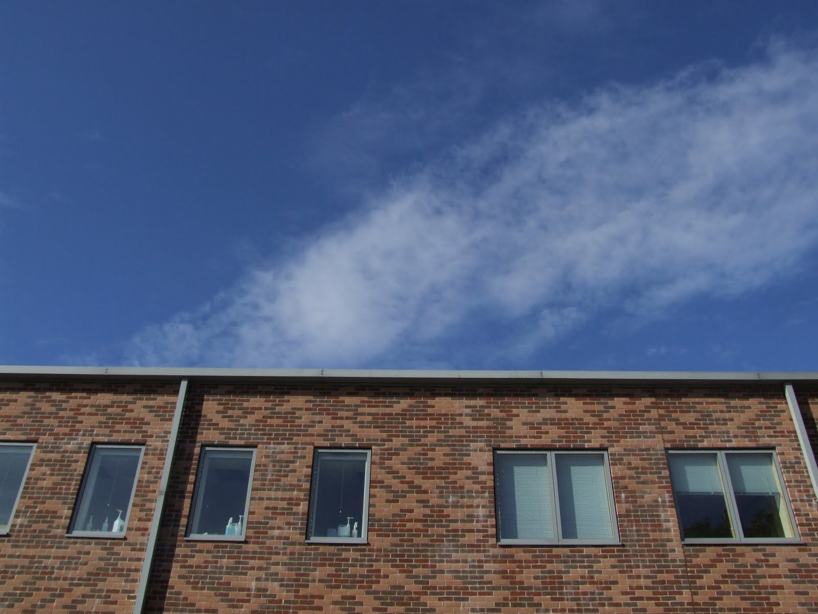
I decided to include this image in my top five for colour because I love how the dark, saturated blue of the sky contrasts against the muted browns and reds of the college building. The neutral white of the clouds in the sky also put more accentuation on the sky's saturation.

This is probably my favourite image that I took for colour. I love how the washed out, muted blue looks in contrast with the dull neutral white of the garage. Due to the fact that the colour has been combined with something neutral, there is therefore much more accentuation on the colour.

I decided that this was one of my top five images for colour because there is a contrast between the saturated background colour that was the red with the dull, muted greyish green colour of the paint. There is also a lot of texture present in this image due to the cracks of the paint. Upon first looking at this image, a viewer may not be quite sure what they are in fact looking at. This is why I think it was a successful image.
No comments:
Post a Comment