Straight Images

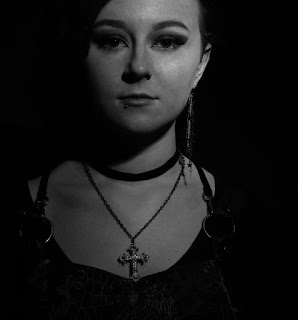
I liked this image on the subject of tone because of, mainly, the lighting. this makes certain elements of Alex appear darker than others. I edited this image in Photoshop, making it black and white in order to better demonstrate the shadow and tone of the image.
I decided that this was one of my best images also because of the tone and shadows within the image. One could describe this as a very masculine image, due to there being not a lot of lighting and Alex's face and body being heavily shadowed. This makes the model appear more vulnerable in a sense, although the look on their face does make the image seem somewhat sinister.
I liked this image on the subject of tone also, particularly for the sunglasses in the image. They feature a gradient that goes from a light yellow tone to a dark blue one. I edited my image in photoshop, making the image black and white, but leaving the colour of the sunglasses saturated in order to better demonstrate the tone within the glasses.


No comments:
Post a Comment